Guaranteed Rate - "Lightning App"
Background
Guaranteed Rate (GR) is a mortgage and finance company based out of Chicago that offers fully digital experiences to their customers. As their customer base and digital products continued to grow, GR wanted to expand into the mobile realm with their “Lightning App”. The goal of the Lightning App was to provide a one-stop-shop mobile application for customers to access all their GR financial products, pay their balances, track their credit scores, and apply for mortgages, loans, and credit cards. As the Lead UX Researcher for Guaranteed Rate, I conducted a usability test of the Lightning App prototype with 100 users. The goal of the study was to identify areas of improvement in the app's usability and identify pain points experienced by users.
Usability Testing
I decided that we needed a good pool of users to pull data from for the usability test so that we had solid qualitative numbers to match with the qualitative feedback. I settled on 100 users and set up a test within UserTesting.com, since the study required a total of two weeks to return actionable feedback. Once the tests were launched, and users from UserTesting.com passed the screener questions, I had my 100 users and the necessary feedback. For this particular test, users were tasked with moving through the Co-Borrower Refinance flow, where a user indicates that they have a second person to add to the application to buy the house jointly. GR also wanted to know how users preferred to track their progress through their mortgage application; either via a stepped tracker (Step 1, 2, 3, etc.) or a percentage of completion (10%, 35%, etc.).
Positive Feedback
Likelihood of Recommending the Application
Average out of 100 Responses:
8.25 / 10
Easy
Simple
Quick / Fast
Straight Forward / Streamlined
“How easy it was! Just answer a few questions, provide a few documents, and you're all set!”
– User 18
“It was simple, not too much going on to where it would be overwhelming.”
– User 25
“Not burdensome, and fast to complete.”
– User 70
Process Tracker Preference
Stepped Tracking - 58 users
Percentage Tracking - 42 users
“I liked always knowing where exactly I was in the application process; something that has confused me with other financial services.”
– User 77
“I feel like the number of steps is a little bit more specific and makes me feel a bit more in control”
– User 12
Pain Points
Security
Users were unsure about the security of the app and the company. They would like to do their research on GR before trusting them enough to give out their personal information.
“I don’t feel it’s secure. There has been no commutation from the website on its security and process.”
– User 23
2. Lack of Transparency
Users were hesitant to give out their personal information since they didn't know what it would be used for.
“I do just feel like each screen needs descriptions about the purpose of the screen and of the information being asked.”
3. Combine Steps
Users felt that the contact information steps should be combined, which would shorten the app in the user's mind and reduce redundancy.
“I would find a way to make it shorter by including more steps in a single page rather than having to click on next every time.”
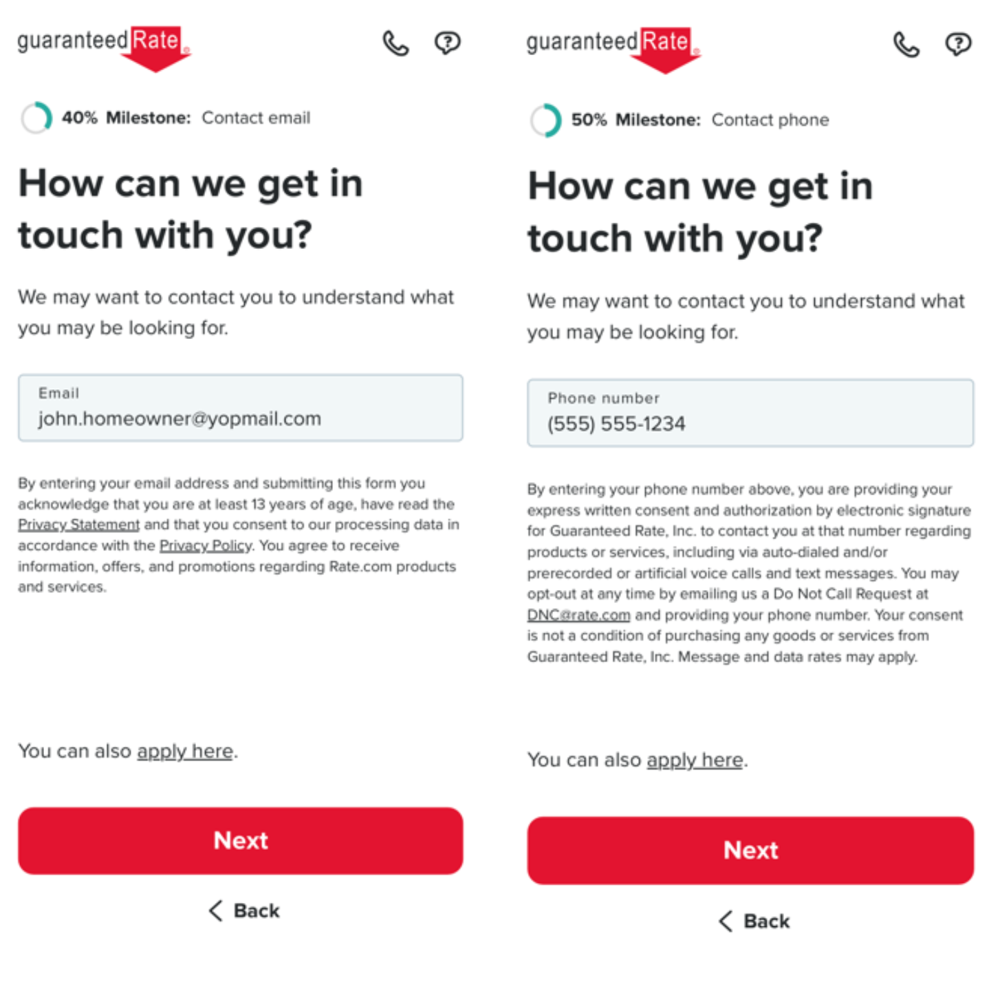
4. Contact Information
Users were hesitant to give out their contact information when they haven’t seen any rates yet, are unsure of the security of the company, unsure how the information will be used, unsure why the information is necessary, and unsure if they want to go with GR at all.
Users are more apt to give out their email than their phone numbers. They don’t want spam calls when they haven’t decided on using GR past checking for rates.
“If I am using a mobile app or website to browse information regarding a refinance, I don’t want to talk to somebody. Perhaps when I’m feeling certain I want to proceed, that would be important to speak to a rep, but I do NOT want to receive robo calls or sales calls.”
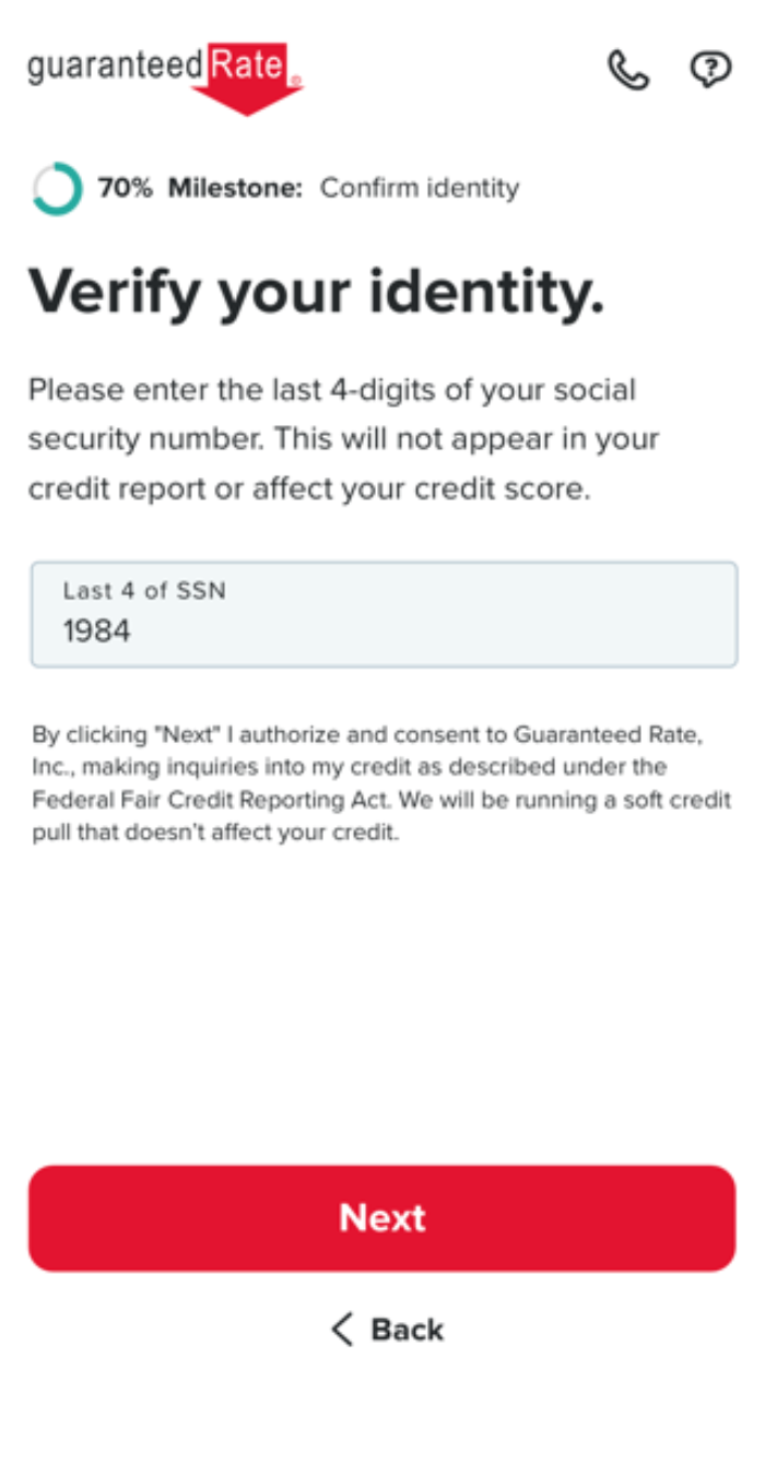
5. Social Security
Users were generally hesitant to give out their SSN and didn’t exactly know what a soft credit pull was and how it would benefit them.
“It is too early to retrieve social security last digits, if I have not decided whether I want to go with this company.”
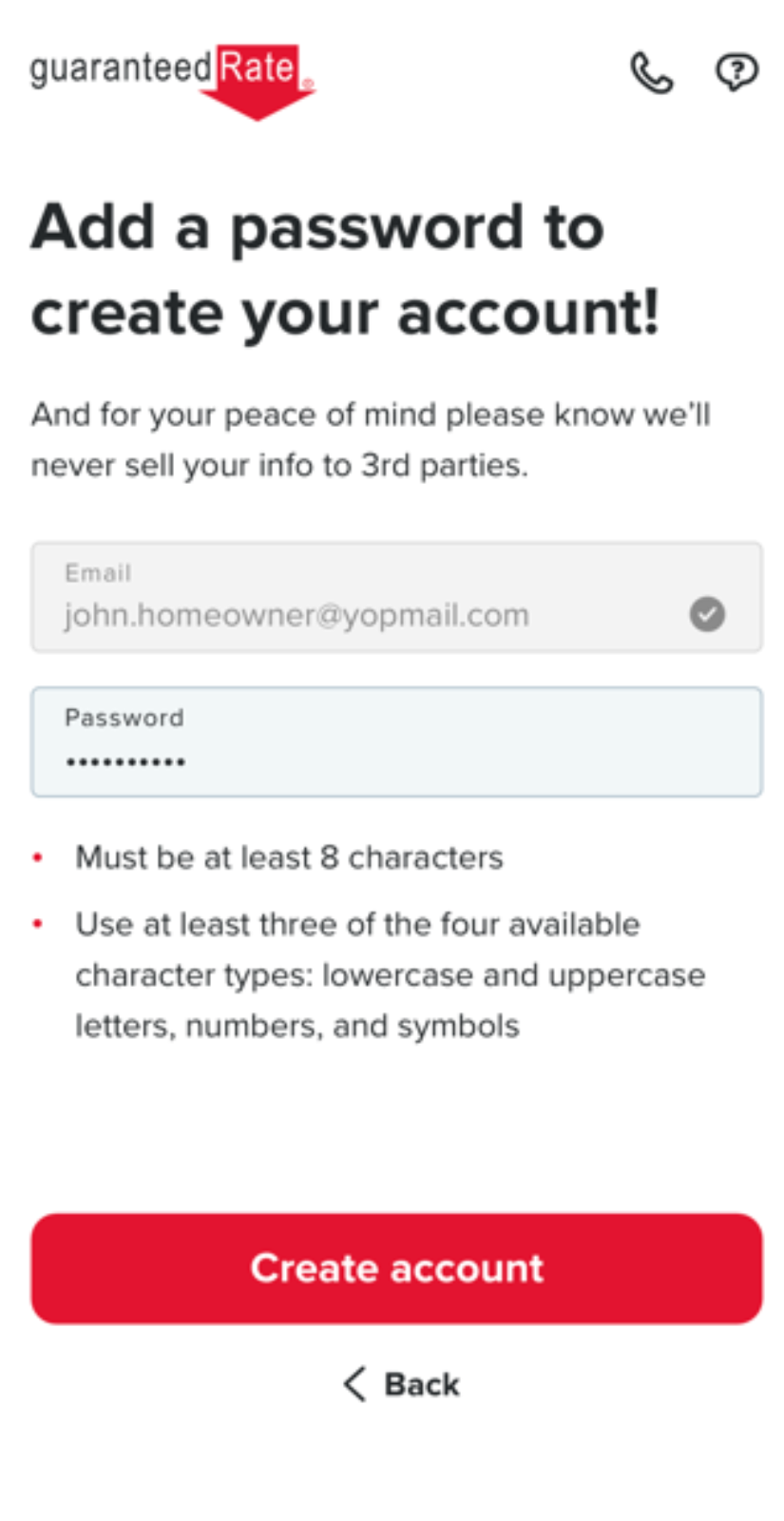
6. Account Creation
Users are unsure how creating an account will benefit their experience looking for a mortgage. They are hesitant to create an account if they aren’t sure if they want to sign with GR and are just comparing rates with other companies.
“I think this is kind of a big decision, so I would like to take a break and think about it before I commit.”
Journey Map
Utilizing the Refinance with Co-Borrower persona, I created a user journey map that tracked the experience of the persona using the Lightning App prototype. The user was taken through the 4 main stages of the journey: 1. Start application 2. Verify property owners 3. Contact Information and 4. Verification of Records.
Overall, the users were taken on an emotional journey that ranged from happy, to skeptical, to irritated, to unsure, and everything in between. Using direct quotes from users, I was able to highlight their perspectives on the prototype and help stakeholders develop empathy towards the user’s perspectives.
Click on image to enlarge.
Recommendations
Based on the findings from the usability testing of Guaranteed Rate's Lightning App prototype, as the UX Researcher, I recommended implementing the following solutions to address the pain points:
Security Assurance
To ensure users feel secure about their data and personal information, Guaranteed Rate should clearly state that all user information will be kept secure. The company can also consider implementing secure sub-domains, adding secure badging or s third-party statement to reinforce the message.
Increase Transparency
Guaranteed Rate should let users know what their information would be used for and how this would benefit them. One possible solution is to incorporate flyout or overlay tooltips with more information about industry jargon (such as "soft credit pull," "cash out," etc.). Additionally, the company should consider working with copywriters to revise their copy and eliminate industry jargon to help make the language more user-friendly.
Expand on Contact Information Feature and Copy
Guaranteed Rate should inform users about how their phone number or email will be used, as well as give them the option to be contacted via phone calls or text messages. To do this, Guaranteed Rate can specify what users will and will not receive through marketing contact and change the language from "may" to "will" to set expectations more clearly.
Social Security Number (SSN) Enhancements
GR should explain to users why their social security number is needed and how it will be used. The company can also provide more information about what benefits users will receive from a soft credit pull. To make users feel more secure about entering their SSN, the company should add a security badge or icon to reinforce the message. Finally, Guaranteed Rate should consider adding an exit option on the SSN page to give users the opportunity to exit the process if they are not comfortable sharing their SSN.
Account Creation Automation and Copy
GR should make it clear to users that creating an account does not commit them to signing with the company but will only save their information. To eliminate users' unease, the company can automate the account creation process, or repurpose the screen to let them know their information is saved and they not being forced to sign with Guaranteed Rate.
Auto Save and Copy Enhancements
To make the application process more user-friendly, Guaranteed Rate should design a way for users to save their app information if they get interrupted. The company can let users know they can pick up where they left off if they haven't cleared cookies and history, or consider implementing an auto-save feature.
Conclusion
By conducting a usability test with 100 users, I identified several pain points that users experienced with the Lightning App prototype. Based on the findings, I recommended changes to improve the app's usability and increase users' trust in the company. These changes will not only improve the Lightning App's performance but also increase user satisfaction and trust in GR, and reduce users' hesitation to share their information which will lead to them completing the mortgage application process.


