KP - ePIMS Pharmacy Software
Background
Kaiser Permanente is the nation’s leading not-for-profit health plan with more than 600 locations in 8 states and Washington D.C.. The company endeavors to offer quality healthcare to their members and moves towards evolving their technological offerings.
In 2018, Kaiser Permanente was given a grant to redesign their Pharmacist/Pharmacy Technician software used at all their pharmacy locations. The software allows the users to place, receive, process, manage, and deliver prescription orders and hadn’t been updated in nearly a decade.
I was brought in as a User Experience Researcher to work with a Senior Researcher to initially perform an in-depth user experience discovery phase. Discovery included user shadowing, contextual inquiry, interviews, stakeholder interviews, and deconstruction of the ePIMS system workflows. Following the discovery phase, the UX endeavor was approved to begin using our research findings to reconstruct the ePIMS Order Entry workflows and redesign the Order Entry aesthetic.
ePIMS Profile Review
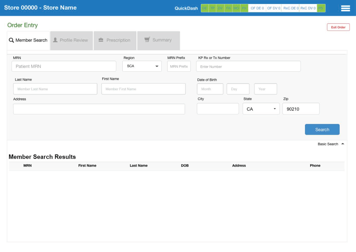
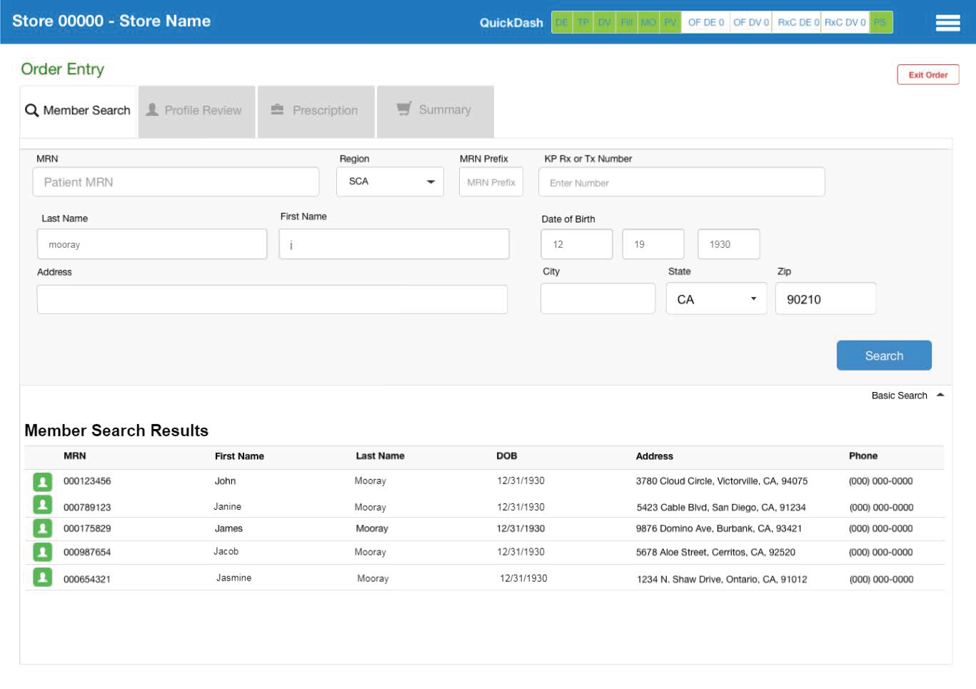
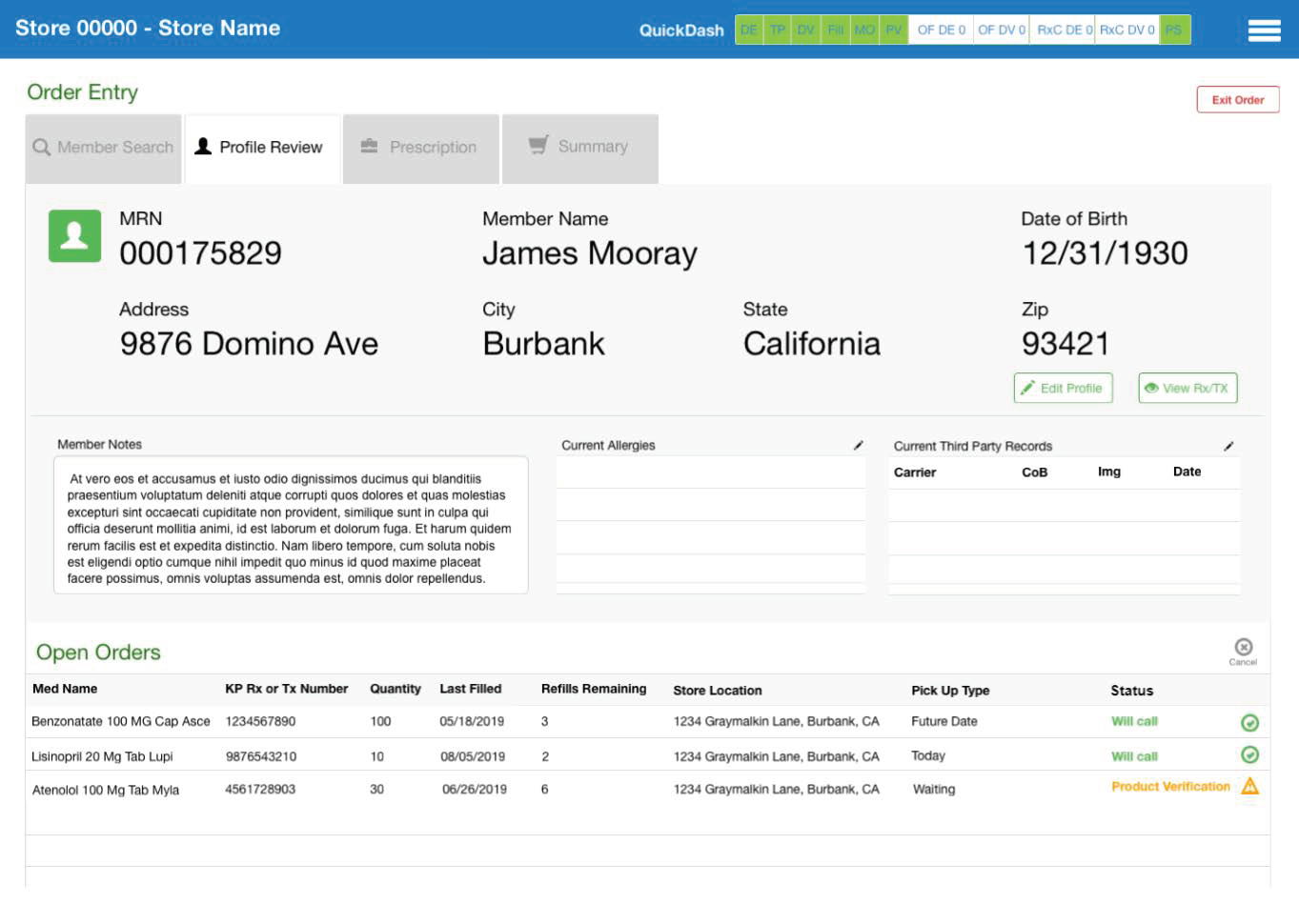
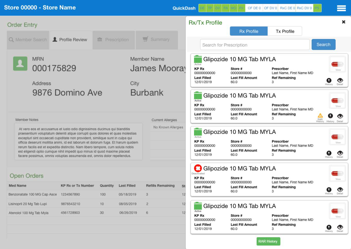
Final, hi-Fidelity Mockup of the Profile Review tab of the redesigned ePIMS pharmacy software.
Discovery Phase
During the Discovery Phase, I was trained on how to use the ePIMS software. From there, I performed stakeholder interviews, user interviews, shadowing, and contextual inquiries at several KP pharmacy locations in Colorado, Southern California, and Georgia; I also executed usability testing and a heuristic evaluation for the current system.
The data from my research, allowed us to glean information on how users worked, how they thought about what they were doing, and how well the system supported their natural task flow. The Discovery Phase took place from October to December 2018.
Discovery Usability Focus
During the Discovery Phase on ePIMS, I focused on the following usability heuristics during research and testing:
Learnable
Internally consistent, predictable, features are easily discoverable, and the user can use the system effectively and confidently with first-time use or minimal training.
Recognizable
User-facing language, standard controls, intuitive, and the user can predict how the system will behave without previous use and/or training.
Efficient
Clear primary tasks, minimal screen interpretation time, easy to scan and legible, minimal task time (e.g. number of clicks, load times, number of tools, etc.).
Error Protection
Mitigation and recovery from errors, accessibility, undo/redo functionality permitted.
Aesthetics
Simplicity, consistency in visual design, minimal display of irrelevant/rarely necessary information.
Unused Functionality Clutters Screens
Slowed down the visual scanning of the screen, and often covered a significant portion of the screen. This added further cognitive load and task times for users in a high-touch, quick-paced environment.
Discovery Findings
127 Negative Usability Findings, 107 Unique Tasks Observed in ePIMS
6 Themes emerged from the data:
High Touch
Users were frequently moving around, looking away, and scanning back into the system.
Interrupted Workflows for Data Corrections
When users were completing a task on an order, and had to send that work “back” to another station, they may or may not have gotten that same order back, which meant that another user had to pick it up and familiarize themselves with what the order was and what had been done.
Scan-ability and Use of Space
Most of the information needed was available, but screens needed to be modified for easier scan-ability and use of space.
Toggling Interrupts Flow
Users had to log in to multiple systems to complete tasks and had to remember what they were doing as they navigated through the different systems and logins; this caused cognitive overload.
Messaging, Notes, & Pop-Up Overload
The system was so overloaded with unnecessary messaging, notes, and pop-ups that the staff mostly ignored them to quickly move through their tasks.
Next Steps
Given that 36 of the negative usability findings were in the Order Entry section, and significantly slowed down productivity and processing times, the stakeholders decided to focus the redesign effort on improving that portion of the software. My coworker and I were given permission and funding to move into the User-Centered Design Phase of the ePIMS project.
User-Centered Design Phase
This phase of the project began in January and ended in August of 2019. I deconstructed the Order Entry workflow and pieced it back together using detailed process flows. After the flows were approved by stakeholders, I moved to wireframing screens using Figma. Once the wireframes were approved, we took them to two different Pharmacy locations and tested the wireframes with Pharmacists and Pharmacy Technicians. I then took the feedback from the wireframe tests and adjusted the designs, then brought in a Visual Designer to work with me to create three different designs that incorporated Kaiser’s styling, functionality, and behavior.
The stakeholders were presented with the three mockups and they selected the design that they wanted to move forward with. At the time, Figma’s prototyping capabilities were not sufficient for the purposes I needed to make the prototype as lifelike as possible, so I brought the designs into Proto.io and created a hyper-realistic prototype there. I then created a testing protocol and we went to another pharmacy and tested the design with users. We finished this phase of the project by adjusting the designs based on the feedback and presenting everything to the stakeholders for their final sign off.
Focus
With the work completed during the User-Centered Design Phase, I was able to address 24 of the 36 usability issues. The following were the key issues addressed:
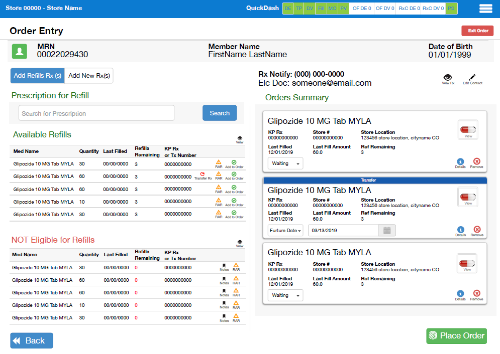
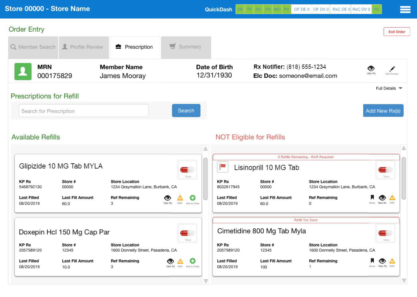
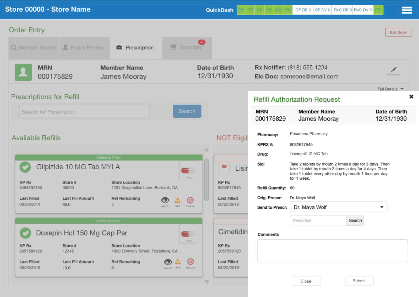
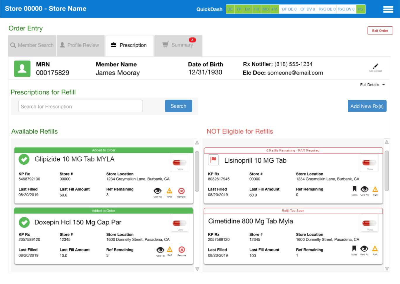
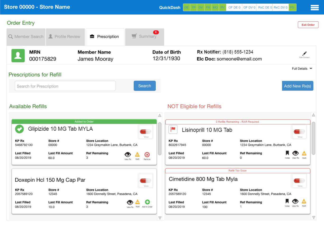
Reduced incorrectly routed refill requests by bringing the relevant refill information on available refills to the start of the workflow, rather than finding out that the prescription can’t be refilled during the last step of the filling process.
Improved the member experience by reducing wait times.
Streamlined the Pharmacy Clerk/Technician/Pharmacist experience by making it easier for them to complete their tasks in the Order Entry step by at least 7 seconds.
Reduced the number of screens needed to enter orders by 2.
Reduced the number of clicks to complete the Order Entry by 5-12 (depending on the workflow).
Kept the user in the Order Entry screens by integrating with other systems so that the user no longer had to toggle back and forth and log in to various other systems outside of ePIMS.
Process Flows
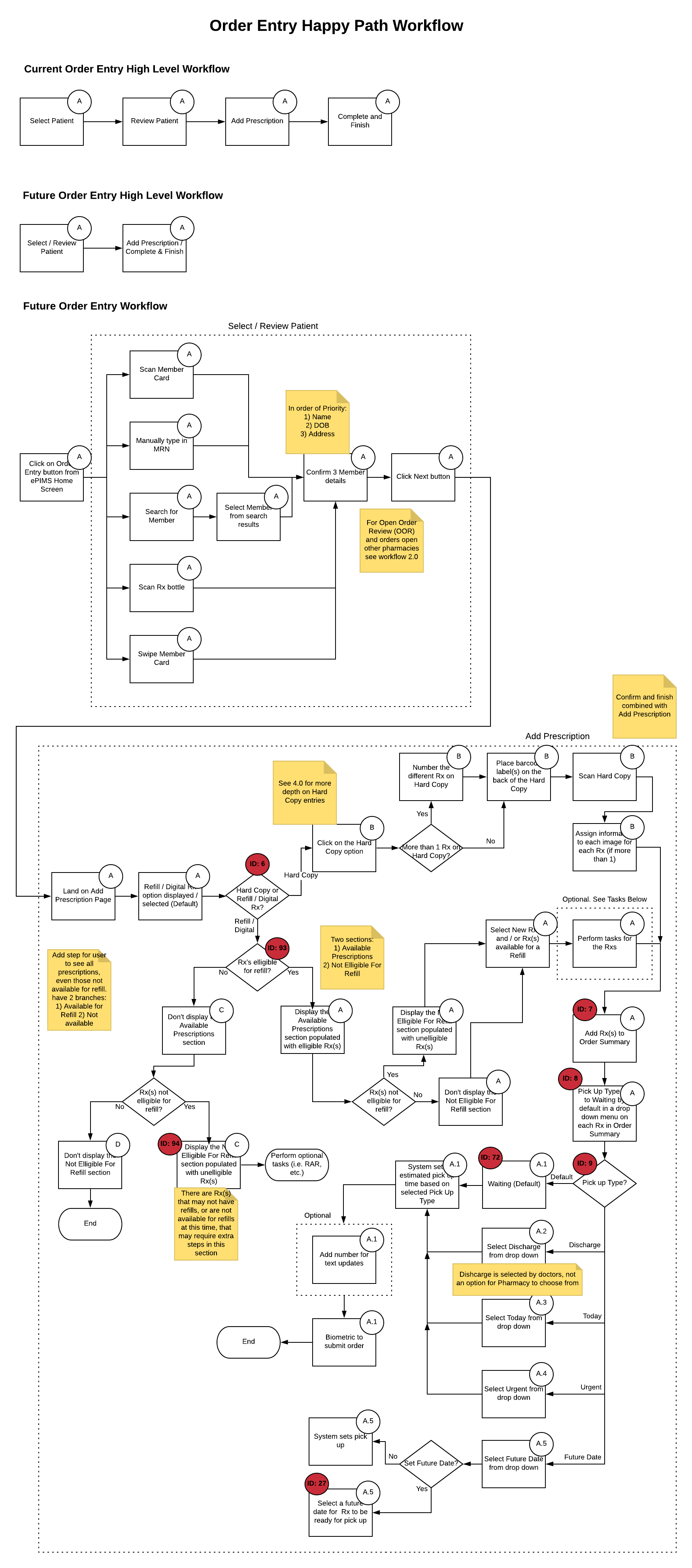
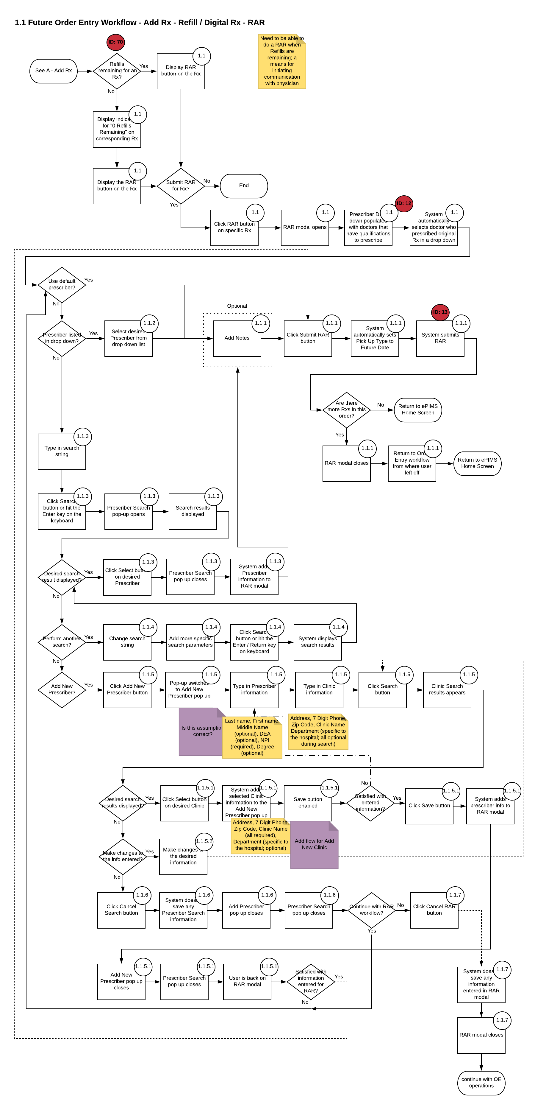
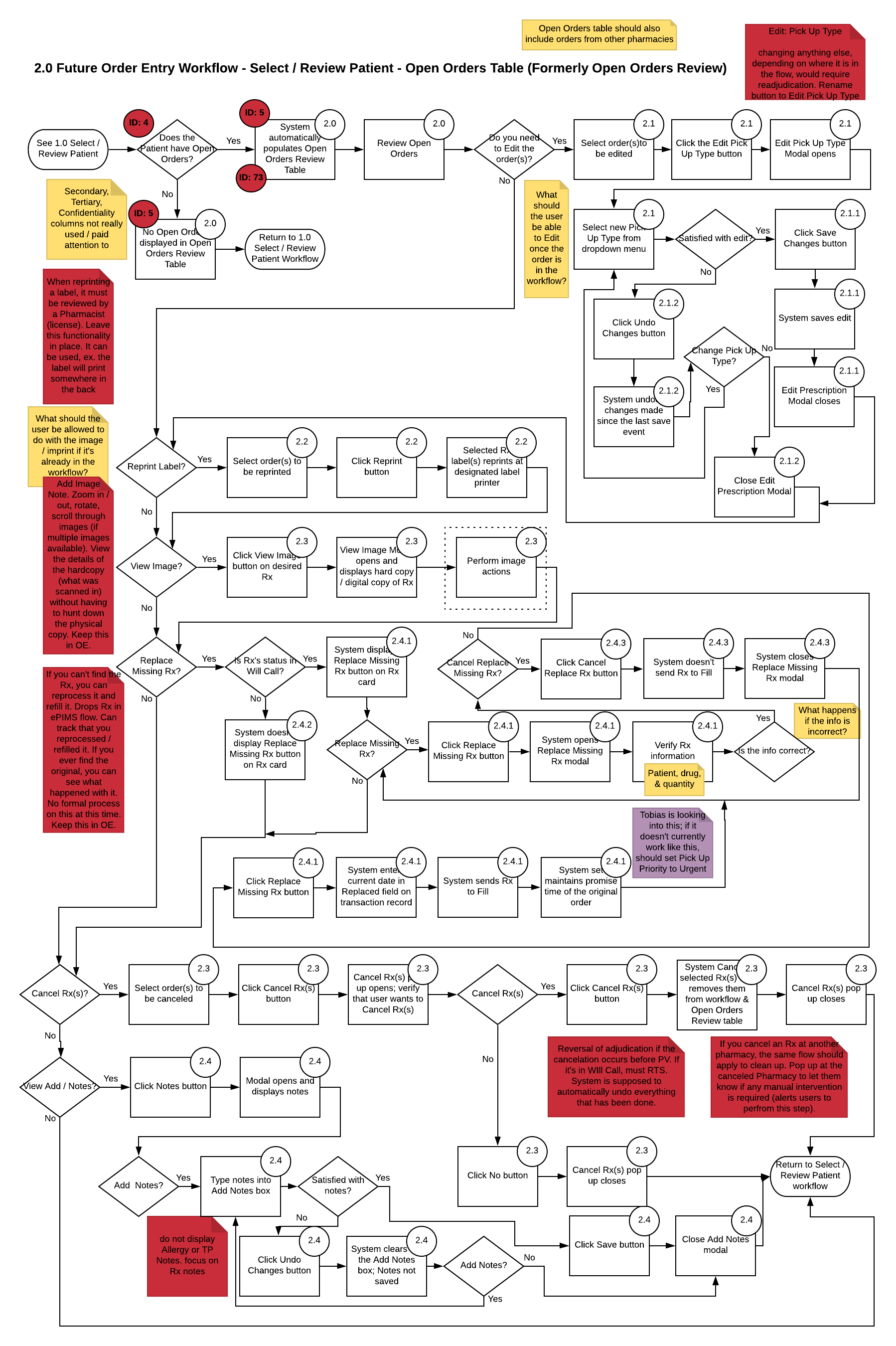
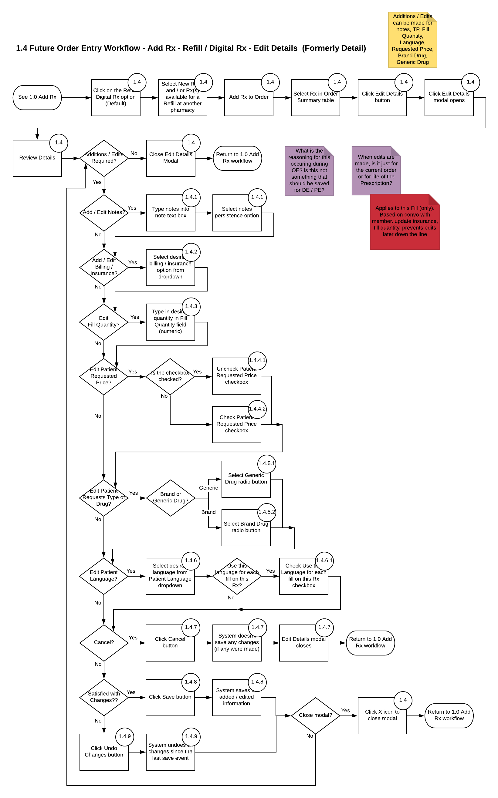
I began by going through the training manuals and documentation for the ePIMS system and notating how the current system functioned. From there, I compared the system to the research data we produced and began to redesign the Order entry workflow by way of detailed process flows. Once the flows were complete, I presented them to the stakeholders; they were approved, giving me clearance to begin wireframing.
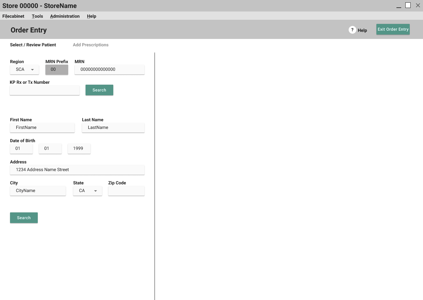
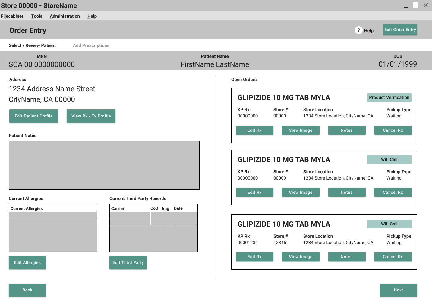
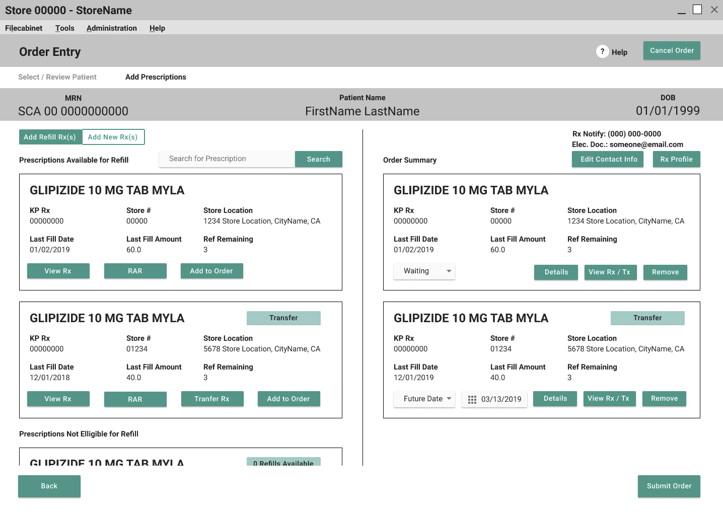
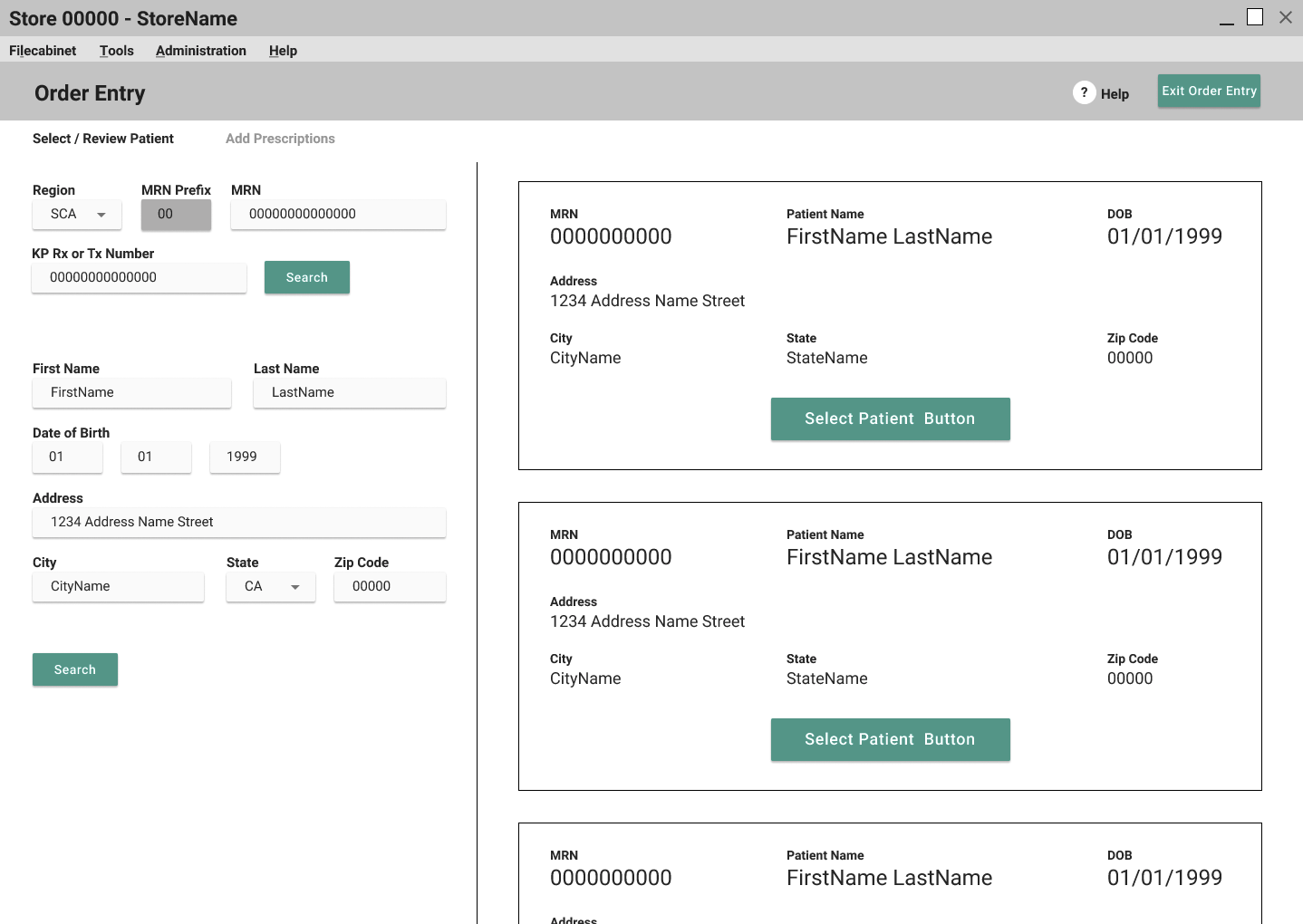
Wireframing
To wireframe the Order Entry process, I used Figma, due to working remotely and it allowed me to use their web app wherever I was for testing while I was in the field. I created the first round of wireframes, got them approved by stakeholders, and then tested them with users at a Pharmacy location. I then took the feedback from the testing and edited the wireframes accordingly. Once the edits were complete, I demoed the new wireframes for the stakeholders and was given the approval to move into visual design mockups.
Mockups
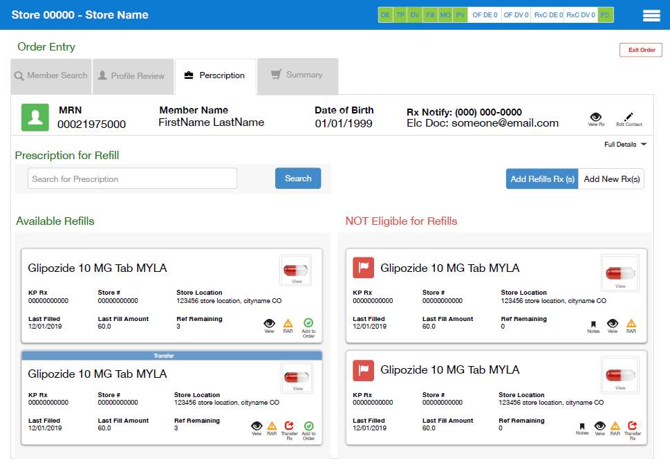
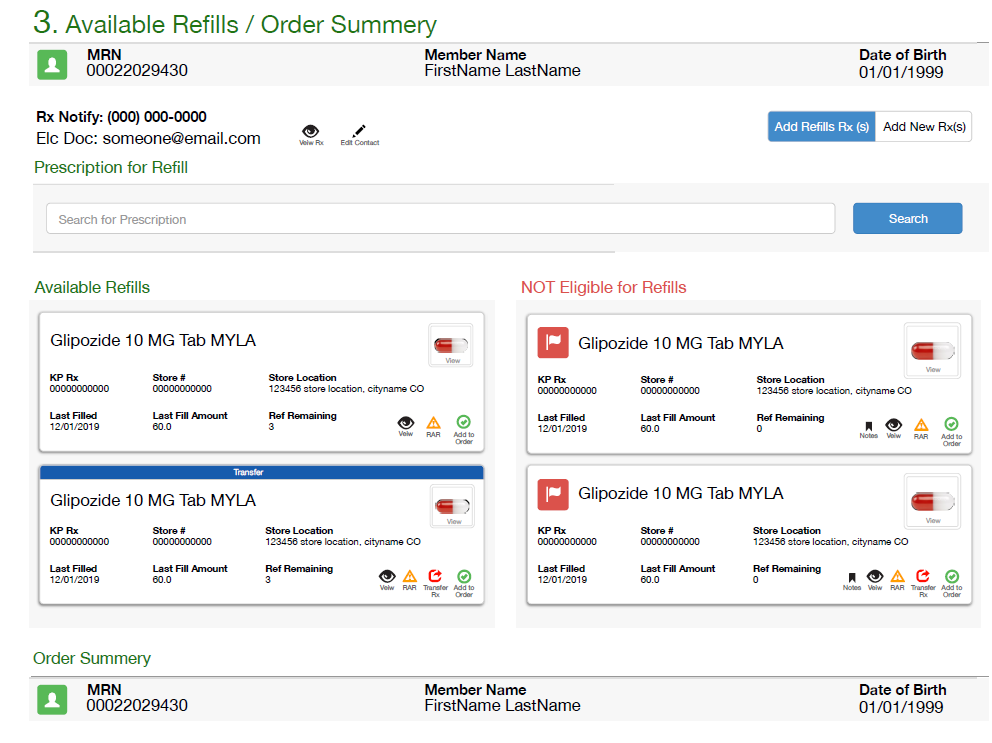
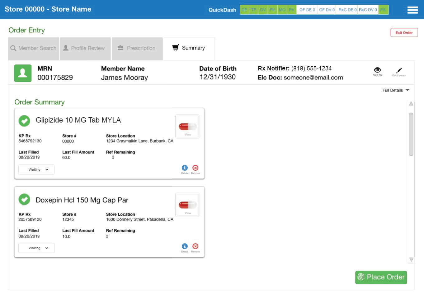
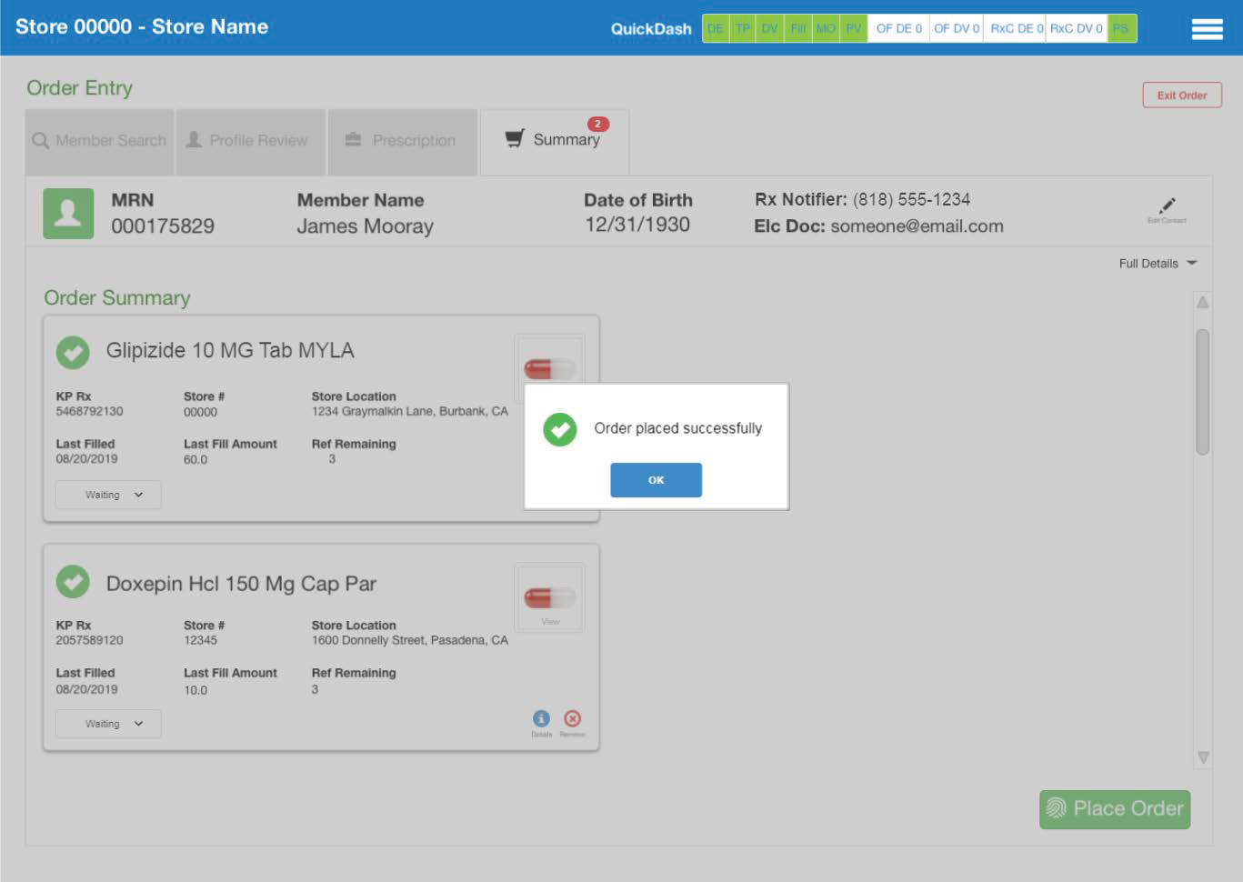
A Visual Designer was brought in to apply Kaiser styling, behavior, functionality, and general aesthetics to the wireframes I created. Continuing to use the Figma web app, since he was working from a different state, we were able to put together three different versions of the suggested design: the tabbed view, the parallax view, and the wizard view.
Once we demoed the three designs to the stakeholders, they selected the tabbed view and gave us clearance to test a prototype of the design.

Prototype
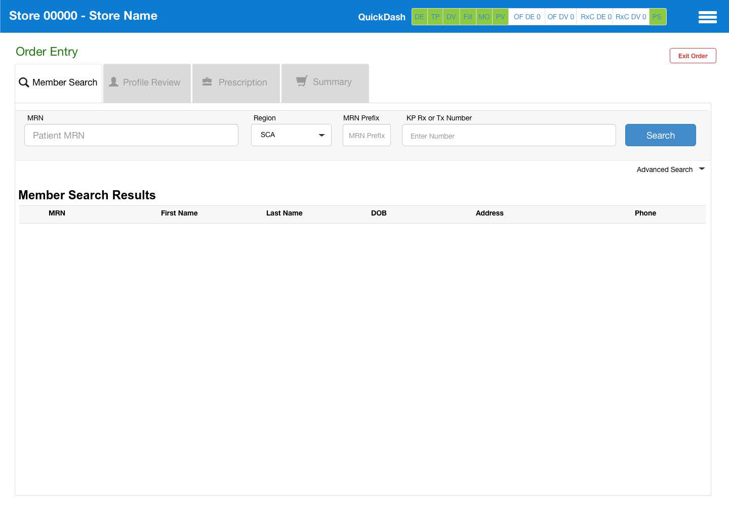
Taking the tabbed view version of the mockup, we built out the rest of the Order Entry process in that style. Once the mockups were approved, I imported the Figma mockups into Proto.io and created a realistic mockup that simulates a true Order Entry task.
I then created a user testing protocol for the prototype and went to a Pharmacy location to test with six users ranging from Pharmacy Clerks, Technicians, and Pharmacists. I executed the same tests at 2 other pharmacies (one in Denver, Colorado and one in Atlanta, Georgia). After the user tests were completed, I presented the prototype and my findings to the stakeholders so that they could move the redesign into development.
Final Presentation
Bellow is a link to my final presentation for the stakeholders of ePIMS:


